
Nissan redesigns brand logo for digital world
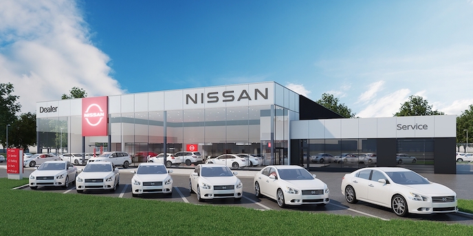
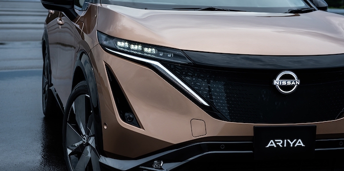
Nissan has unveiled its new two-dimensional (2D) logo on the all-electric Ariya crossover, as the manufacturer rolls out the new corporate identity from this month.
Nissan’s global design senior vice president Alfonso Albaisa initiated the logo redesign process in 2017.
The design team was challenged to create a new logo that would meet government compliance when illuminated on vehicles, but also make a strong impression when not illuminated such as on paper, on buildings, or in a digital format.
The new 2D Nissan logo will make its appearance this month in digital and physical forms.
Nissan’s electric vehicles will feature an exclusive illuminated logo lit by 20 LEDs (corresponding to the number of years between logo redesigns), a visual reminder that the manufacturer is driving towards an electrified future.
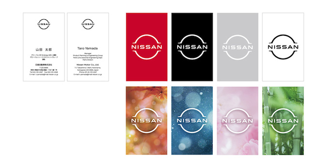
This will be followed by the new logo being incorporated across mediums; from letterhead and dealership signs to social media and digital advertising.
One of four iterations will allow the new logo to flexibly accommodate varying communication points says the manufacturer.
Albaisa says the Ariya is the perfect platform for the new logo and was a key influence in how it was tailored. It will be worn by more new vehicles in the coming years.
He set up the logo design team led by Tsutomu Matsuo, deputy general manager of Nissan’s advanced design department, to study everything from a subtle evolution to a complete reinvention.
“Inspiration was drawn from breakthroughs in science, technology and connectivity. How these have brought fundamental changes to our customers,” Albaisa says. “As you can imagine, visions of digitalization started swirling in our heads.”
Over the next two years, the team sketched and plotted several iterations.
The team needed to consider several variables, including an early decision for the logo to be illuminated on upcoming all-electric models.
After countless sketches and several mock-ups, the result was a logo with a two-dimensional impression. Looking more designed than manufactured, it has the flexibility to live in multiple worlds. The process started in 3-D and then developed in 2-D – the illuminated brand badge was drafted first, pulling the illuminated area out to represent the brand in 2-D form.
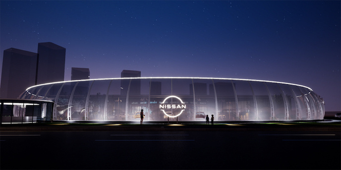
The overall effect of the redesign is a transition from a hard-edged, industrial feel to a refined, familiar and digital-friendly look says Nissan.
“The new Nissan logo communicates our guiding message, carried over from past iterations: If you have a strong, determined belief, it can even penetrate the sun,” Matsuo says.
“At Nissan, this strong belief in the power of achievement has never wavered and can be seen in our efforts in electrification, driver assistance and digital connectivity. Our logo has to convey all of this in just a glance, to show our commitment to our customers, employees and society.”


Join the conversation